There’s no denying that the toy aisles within our favorite mass retailers are among the most visually-chaotic and ever-evolving environments for consumers to navigate. Every toy and entertainment brand is vying for the attention of parents and children alike within this highly competitive retail landscape. Maintaining their attention and motivating their purchase decisions is no easy task.
As an expert in package design for licensed toy and entertainment brands, I understand the importance of staying informed of market place trends and graphic approaches, and how this insight can translate to package design that actually sells. Let’s take a look at some existing and emerging trends among licensed brand packaging, and how licensors are leveraging them to establish a look that stands out on store shelves and resonates with consumers.
Breaking through via design simplicity
Minimalist design has emerged as a powerful package design trend being adopted by many consumer product brands, with licensed brands being no exception. Licensed brands are now opting for clean, uncluttered package design that focuses on essential design elements and communication, allowing brand identity and character art to take center stage. This approach creates a more sophisticated and visually-impactful look that contrasts the chaos on shelf, drawing the eye of consumers.
I’m seeing licensed product packaging programs relying primarily on a single, solid, bold color that dominates the entire package design system. Marvel’s Spidey and His Amazing Friends packaging is primarily white, which makes the images of Spidey, Gwen and Miles in action and the fun, primary-colored logo stand out beautifully. The packaging program for The Super Mario Bros. Movie licensed products is a sleek, black design with an upscale appeal. Again, the logo and character art, along with the product name, dominate the on-pack communication. If you look closely, you’ll see a handful of spot varnished game icons on the black background. A subtle design detail that doesn’t interfere with the packaging’s simplicity. When an insert or product field is needed, is uses a subtle, pale grey pattern of game iconography on a white background.
Textured and patterned storytelling
In addition to the use of character artwork and scenery to set the stage for storytelling, some licensed brands are utilizing textures and patterns as the overall background for their packaging programs to bring the consumer into the property’s world.
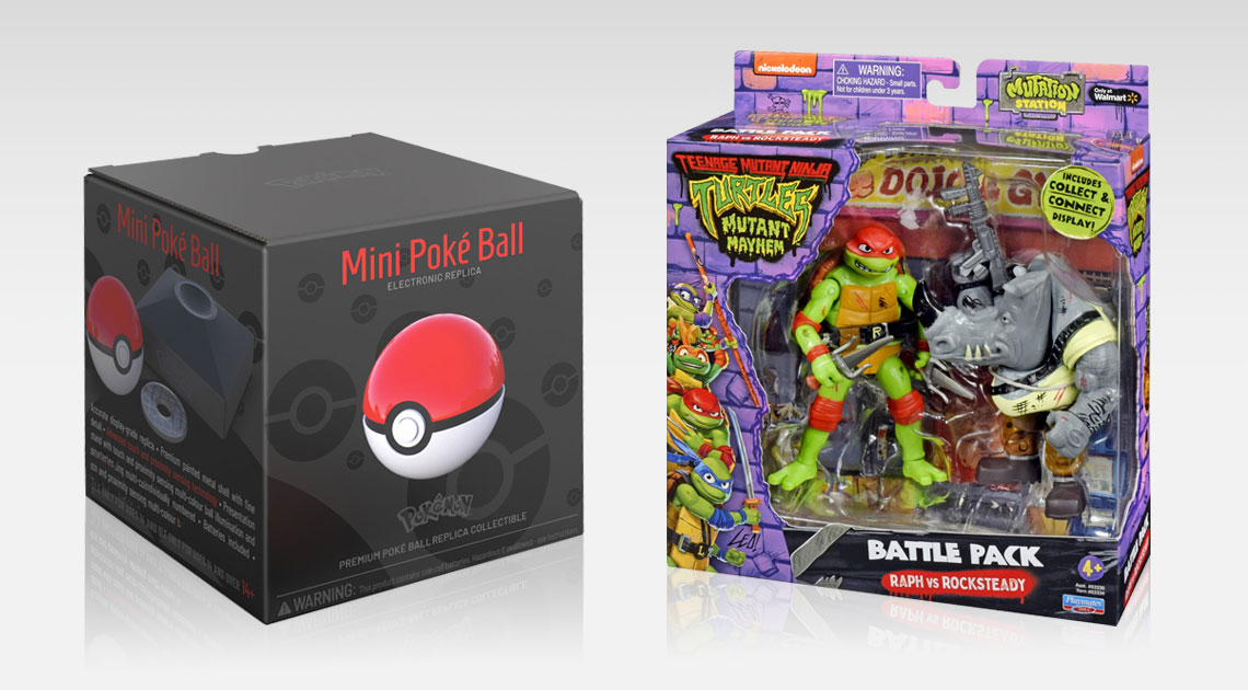
A slimy, purple brick wall serves as the background of Paramount’s Teenage Mutant Ninja Turtles: Mutant Mayhem packaging to take us into the urban sewer environment. A dense, glittery pattern of circles, stars, hearts and abstract cat paws forms the perfect teal and pink textural backgrounds for Dreamworks’ Gabby’s Dollhouse packaging program. Disney, shifting from dedicated packaging for each film to packaging that represents the entire franchise, now uses a bluish-white, crystalized ice texture as the background within the trade dress for their packaging for all Frozen licensed products. And, the Pokémon Company’s packaging for all Pokémon licensed products utilizes a pattern of Poké Balls in tones of red as the overall background, and in tones of light grey on white as the backdrop behind product photos or actual product.
Combining structure and architecture design for visual impact
Establishing unique and ownable package design architecture is a fundamental aspect of my agency’s licensed product package design philosophy. It is a strategy that we use to ensure that a licensed brand will immediately connect with consumers throughout the retail environment, in every product category. When well-conceived package design architecture seamlessly combines with a strong structural design strategy, a licensed brand’s package design system becomes even more engaging to consumers.
Dreamworks’ Trolls: Band Together packaging is dominated by a faceted gem design architecture in vibrant hues that undulate from yellow and green through magenta to violet and cyan. The faceted gem architecture also defines the structural design strategy across all packaging formats to make a powerful brand statement at retail. Although its interpretation sometimes varies from one packaging format to another, the overarching visual aesthetic remains cohesive.
Hasbro’s packaging for Dungeons & Dragons: Honor Among Thieves products leverages an ornate, gilded framing device to define the front panel of every product’s package. Structurally, the corner where the front, top and right side panels meet is a triangular wedge shape that houses the Dungeons & Dragons Ampersand brand element. In this case, the structural strategy forces the frame design architecture to trace the 45-degree angle that it creates, which establishes a distinctive design detail that ties the entire product line together visually.
Package design as purchase motivator
For licensed toy and entertainment brands, staying attuned to new design trends and graphic approaches is essential to maintaining a competitive advantage and retaining consumer mindshare. Remember: the first point of contact between licensed consumer products and their target audience is through packaging. It’s the visual gateway through which consumers enter the brand’s world. If that experience is captivating and engaging, it will leave a lasting impression and influence consumers’ decision to buy.
If your licensed brand is competing in today’s crowded toy aisles, trend awareness isn’t enough. The real advantage comes from translating simplicity, texture, architecture, and structure into a cohesive system that works across categories and formats.
Our approach to licensed product package design focuses on building distinctive, ownable packaging programs that stand out at retail, reinforce brand equity, and perform consistently across every licensee partner and product segment. If you’re ready to strengthen how your brand shows up on shelf, we’d welcome the opportunity to start that conversation.