Moonbug Entertainment
Blippi Core Style Guide
Services Provided: Research & Creative Strategy, Character Art & Illustration, Design Elements Development, Style Guide Design
Style guide refresh for a preschool entertainment licensing program
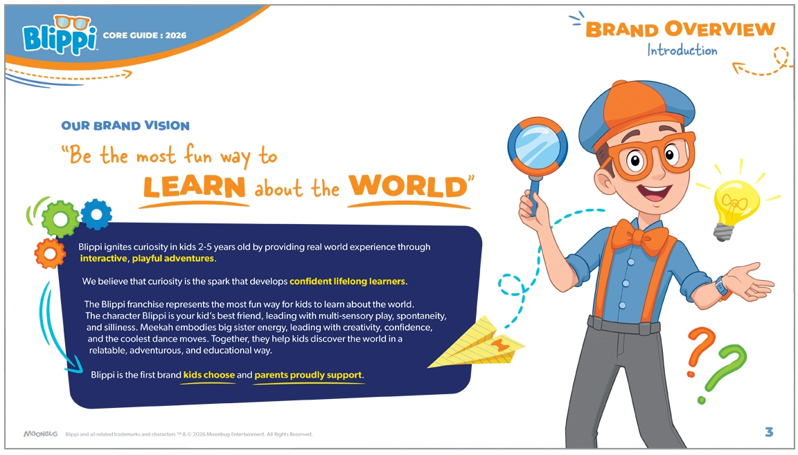
Moonbug Entertainment engaged our design team to refresh the core licensing program style guide for Blippi, the wildly popular preschool entertainment brand and YouTube sensation. The initiative extended far beyond a traditional style guide update, evolving into a complete reimagining of how the brand would be visually represented across licensed consumer products.
The goal of the refresh was to contemporize the licensing program and create a more refined, cohesive visual identity that would feel relevant to today’s preschool audience while remaining true to Blippi’s energetic, curiosity-driven personality and educational mission.
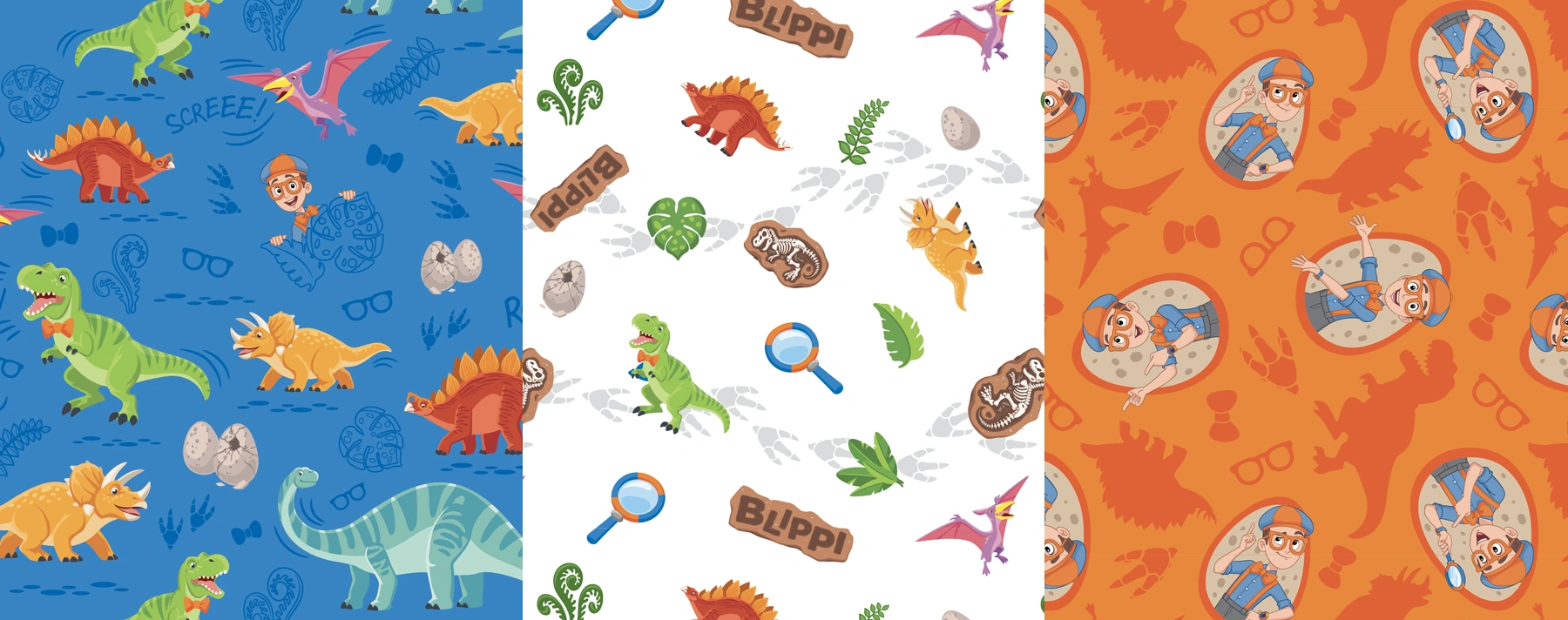
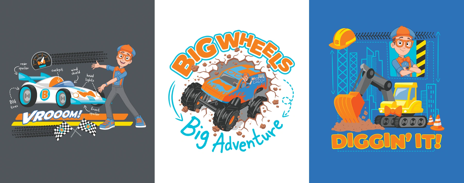
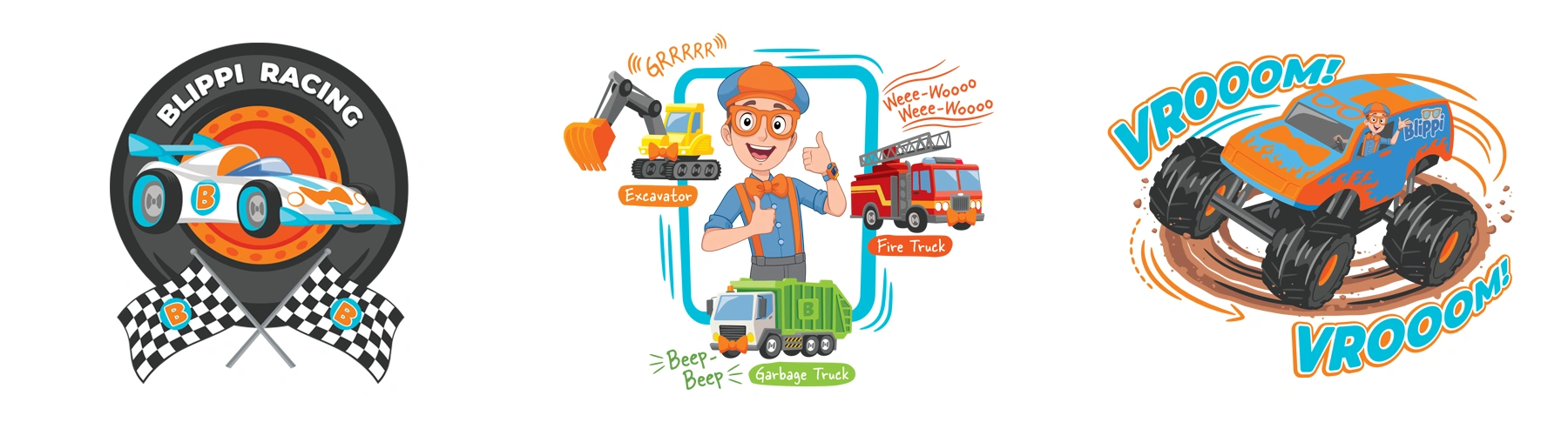
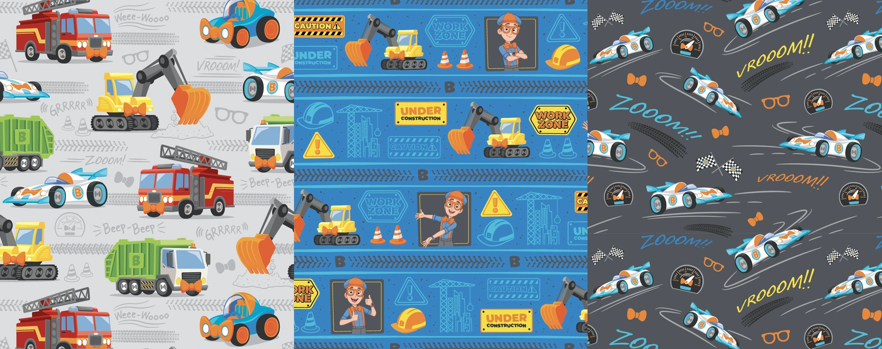
Character redesign and development of new range of character art poses
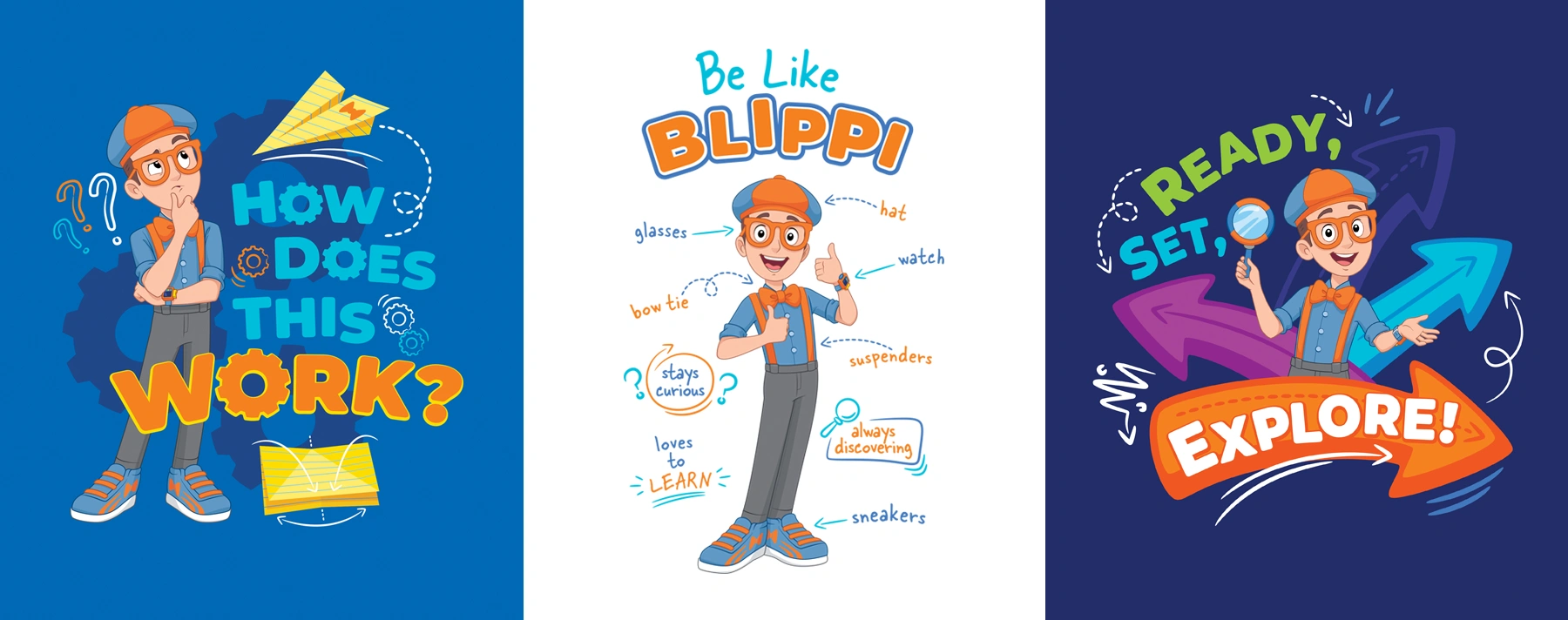
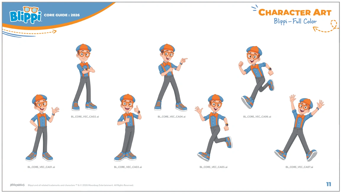
As part of the refresh, our team completely redefined Blippi’s character art style for licensing applications. We established new body proportions, refined the line work and rendering approach, and developed a wide range of facial expressions, poses, and body language designed to capture the character’s high-energy sense of curiosity and discovery.
In addition to the character artwork itself, we created an accompanying library of illustrated props – including Blippi’s signature bow tie, glasses, hat, and watch – all executed in the same cohesive visual style.
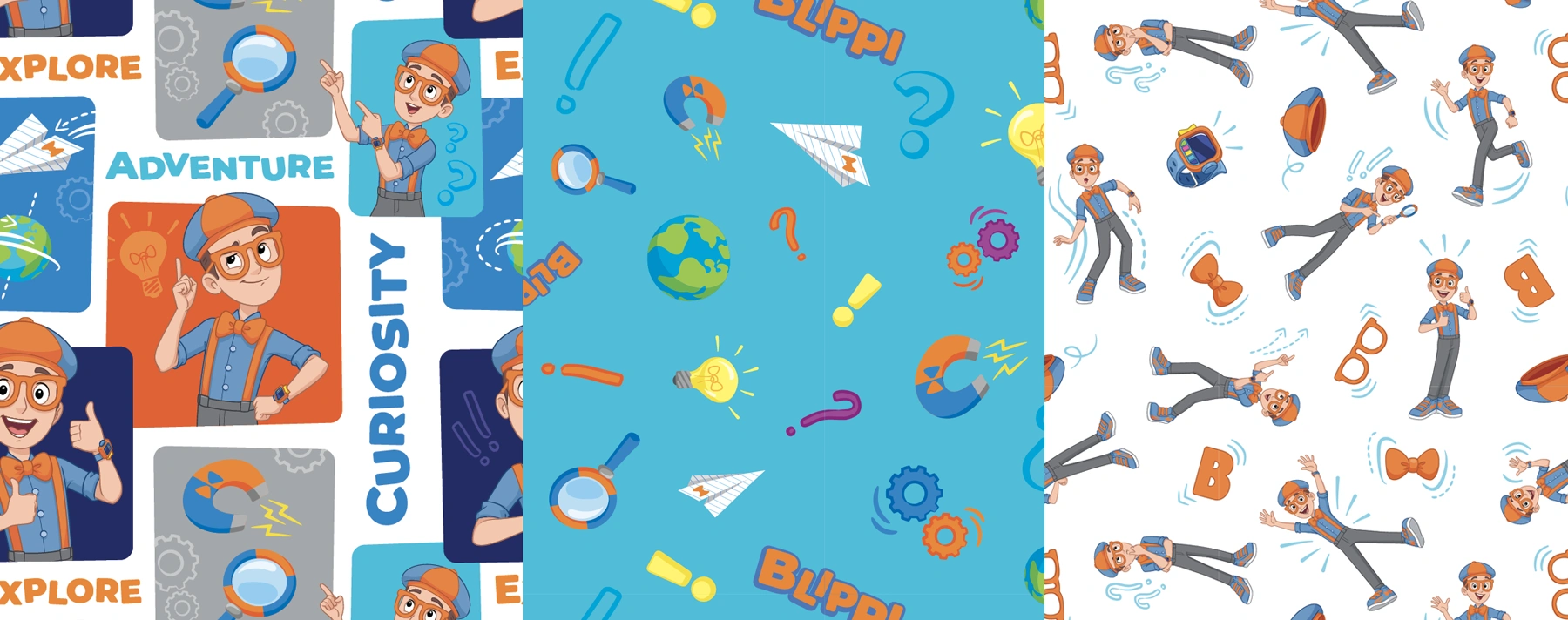
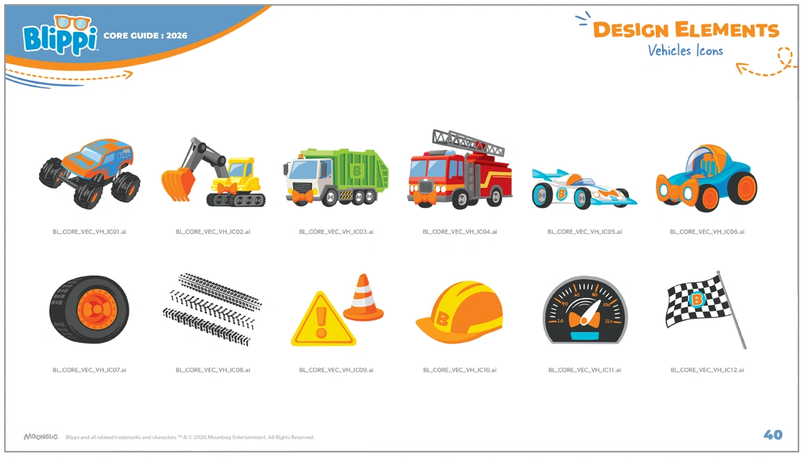
We also redesigned the illustration system for the icons incorporated throughout the licensing program’s design elements. While the new iconography maintained the simplicity appropriate for preschool audiences, it introduced a more polished and refined aesthetic than the artwork featured in previous style guides and existing YouTube content.
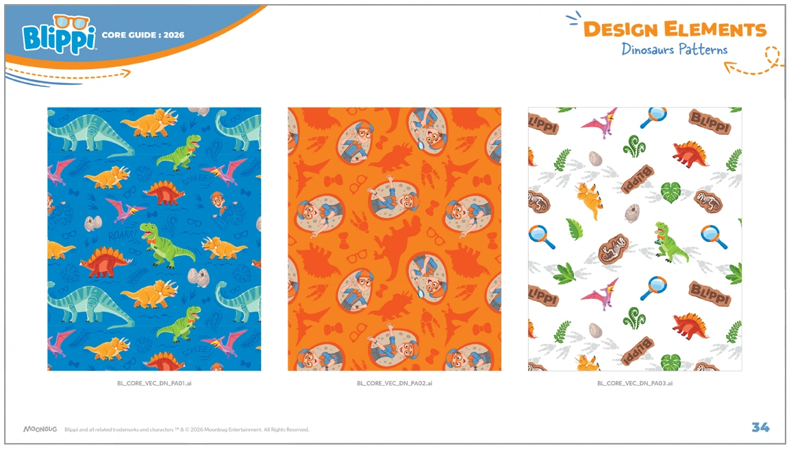
Theme-based licensing program visual strategy development
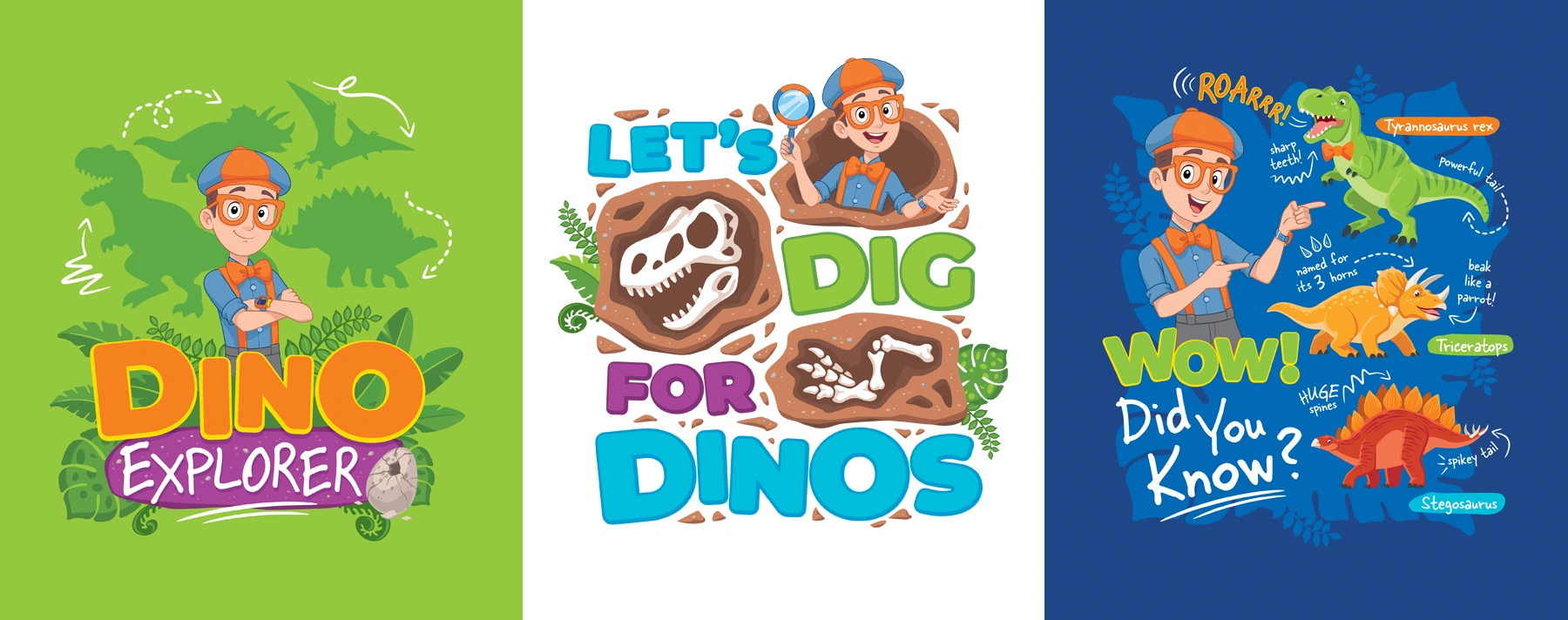
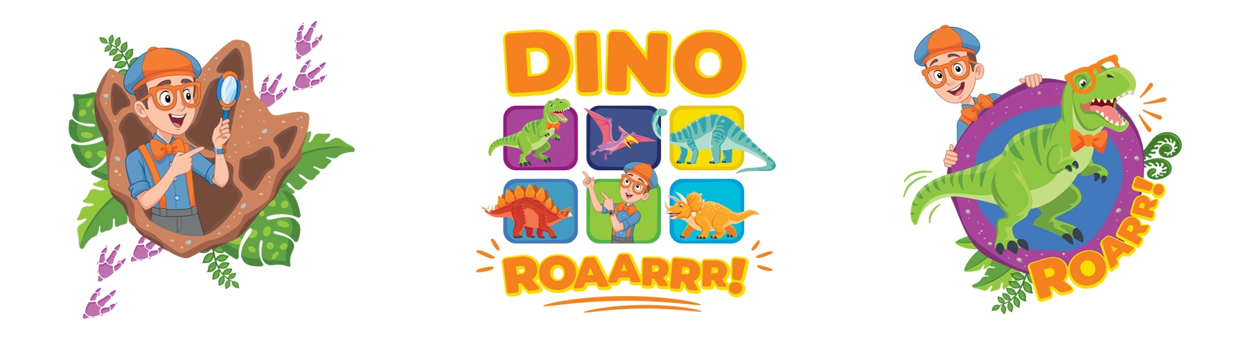
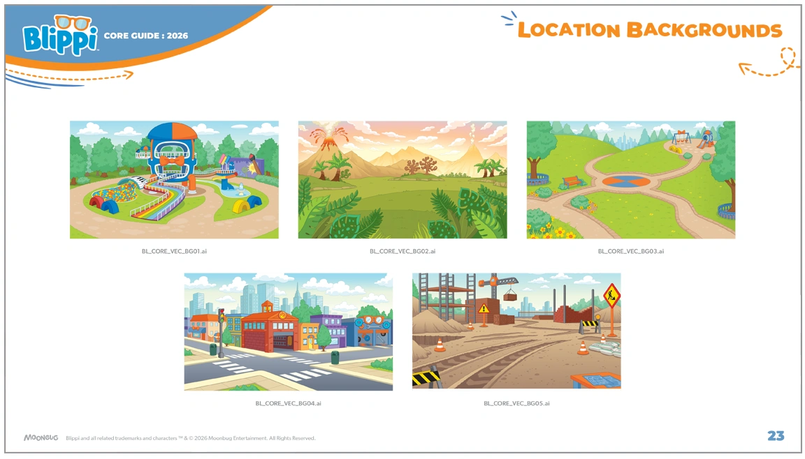
Although positioned as a core licensing guide, the program incorporated three distinct themes woven throughout the design elements and iconography: Curiosity/Wonder, Dinosaurs, and Vehicles.
To unify the program, we established an overarching creative strategy and visual aesthetic that extended consistently across all three themes. A bold, centralized color palette, combined with a stylized graphic treatment, created a cohesive and flexible design system for licensees to leverage across product categories as a recognizable common visual thread.
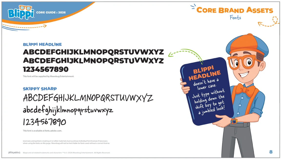
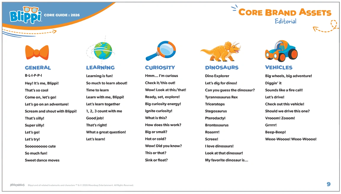
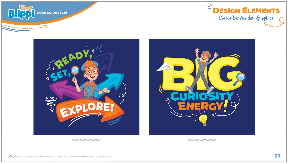
The visual aesthetic incorporated two complementary typefaces – one bold and rounded and another with a handwritten feel – along with gestural lines, arrows, and energetic graphic accents that reinforced a sense of movement, excitement, and exploration. We also developed a broad range of editorial phrases designed to inspire curiosity and discovery, supporting the brand’s core messaging – Ignite Curiosity” – while also supporting the three distinct themes.
Select design elements also introduced “learning moments” that called attention to specific details within the artwork and graphics, presented as call-outs that highlighted facts about the subject matter. Used strategically throughout the guide, these moments reinforced both the educational nature of the brand and the sense of discovery that defines the Blippi experience.