As I was conducting market research for a toy brand’s package design refresh last week, and doing my best to channel the mindset of a consumer who isn’t a package design expert, I was paying particular attention to which colors were catching my eye and why. As package designers, we all know that, amid the chaos in the toy aisles at mass retail, color becomes a powerful brand differentiator. It shapes perception, triggers emotion, and nudges a parent or child toward one product over another. In this environment, understanding color psychology isn’t optional – it’s strategic.
How color triggers emotion in toy packaging
Color isn’t just visual. It’s visceral.
Red pulses with energy and excitement, which is perfect for high-adrenaline toy brands. Blue conveys trust and calm, often used in educational or tech-based toys. Yellow suggests happiness and optimism, a go-to for preschool brands. Pink evokes sweetness and play, long tied to dolls and products targeted at young girls. Green, associated with nature and health, often wraps eco-friendly or outdoor toys.
But beyond these broad associations, the real power of color in packaging lies in emotion. A well-chosen color taps directly into a buyer’s subconscious. For kids, it’s instant attraction. For adults, it’s trust, nostalgia, or a sense of quality. Emotion shortens decision time. In a three-second glance, color tells a story no tagline can match.
Why color sells in the toy aisles
The toy aisles at mass retail aren’t just busy. They’re a war zone of color and characters, with each package trying to outshine the one next to it. Consumers – especially parents – are making snap judgments, often in seconds, under pressure from impatient kids and tight schedules.
Color cuts through the noise.
In this environment, color psychology helps products “pop.” But it’s not just about being bright. It’s about being right. Neon green may be loud, but if it doesn’t match the product’s message – say, something soft and sensory – it can create dissonance and weaken interest. On the flip side, a subtle pastel might stand out because it’s calm in a sea of shouting.
Done right, color becomes a shortcut to the brain: This toy is fun. This toy is smart. This toy is safe. That split-second feeling often turns into action: a hand reaching for the shelf, a product dropped in a cart.
What can you do when all the “good” colors are taken by other toy brands?
Here’s where things get tricky.
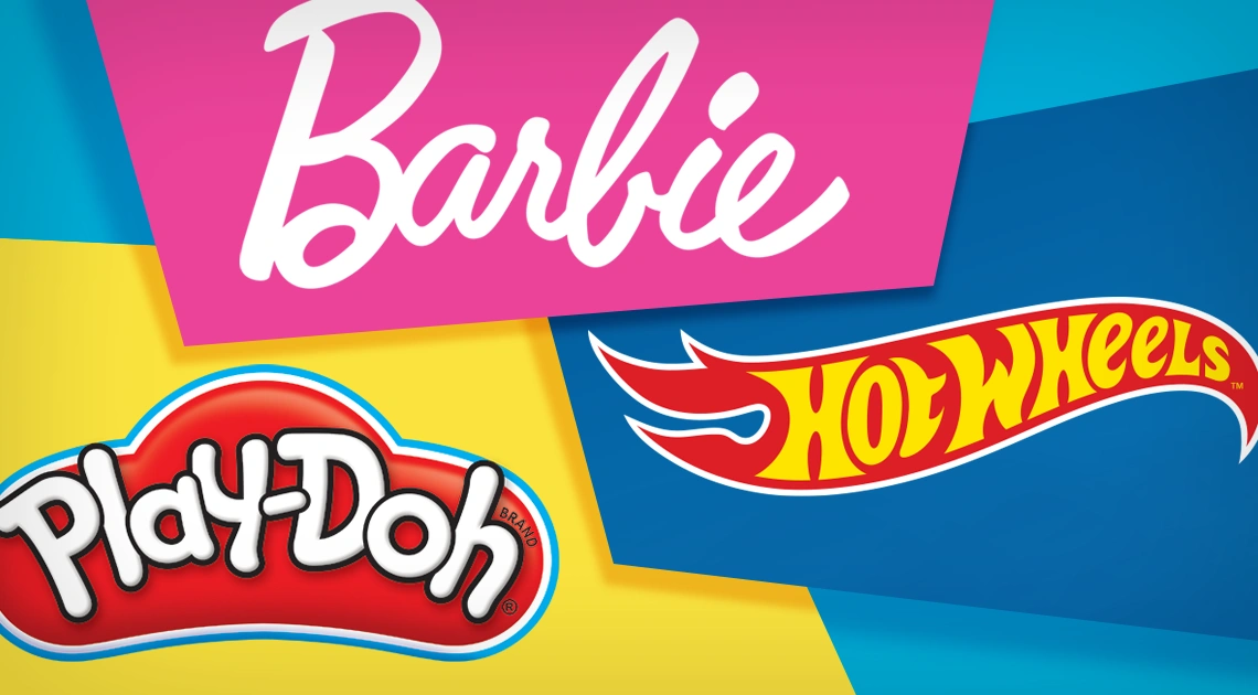
In the toy world, many major brands have already planted their flags in color territory. Think of Barbie pink, Hot Wheels blue, or Play-Doh yellow. These brands have used color consistently over decades to build instant recognition.
So, what does a new or emerging toy brand do when it feels like every emotional color is taken?
The answer lies in strategy, not surrender.
You can own a color palette, not just a color
Brands don’t need to own a single color. They can own a color language.
Instead of staking a claim on one primary hue, smart brands create distinctive color palettes: hierarchical combinations of colors that work together to form a recognizable visual identity. Think of how Crayola mixes rainbow hues with bright green and yellow – it’s the combo that sticks. Or, how Tonka consistently pairs bold yellow with deep black and metallic steel tones to signal toughness and durability.
Owning a palette is more flexible and sustainable than owning a single color. It allows for product variety while maintaining brand unity. It also opens space for mood – one sub-line might skew cool and techy, another warm and friendly – all under the same brand umbrella.
3 smart color strategies for toy package design
When your ideal emotional color is associated with a competitor, don’t panic. Use these three strategies:
1. Twist the Shade
You may not be able to own “classic red,” but maybe you can claim a rich, cherry red or a coral tint. Subtle shifts in saturation, brightness, or warmth can differentiate a brand while maintaining the same emotional trigger.
2. Pair Unexpectedly
Combine colors in fresh, surprising ways. A cool slate blue with neon pink might signal both intelligence and playfulness. A rich plum with lime green could say edgy and exciting. Test pairings that align with your product’s personality but stand out visually.
3. Use Color with Shape and Texture
Color doesn’t exist in isolation. When paired with distinctive shapes, patterns, or finishes (matte vs. gloss, metallic vs. flat), it creates a richer, ownable identity. A brand might become known not just for its palette, but how that palette is applied.
Build your toy brand into one that kids recognize and parents trust
Color psychology is powerful, but it only pays off if applied with discipline. One of the biggest mistakes new toy brands make is chasing trends or mixing colors inconsistently across products. That erodes brand memory.
Own your palette. Apply it relentlessly. Make it part of your story. Because the toy aisle isn’t forgiving. It rewards brands that know who they are and show it clearly, consistently, and emotionally.
Let color work harder for your toy packaging
If you’re competing in the crowded toy market, you need packaging that doesn’t just stand out – it needs to connect with consumers.
Design Force, Inc. helps toy brands harness the power of color psychology in the development of packaging that resonates emotionally, drives brand recognition, and motivates purchase decisions. Whether you’re reconsidering your brand’s color palette or rethinking the look of your brand’s packaging in its entirety, we bring strategy, experience, and design clarity to every brand we touch. Learn more about our approach to package design and let us make color your competitive edge.